The Dow Jones Industrial Average index has been introduced on 26 May 1896 and it has 30 components.
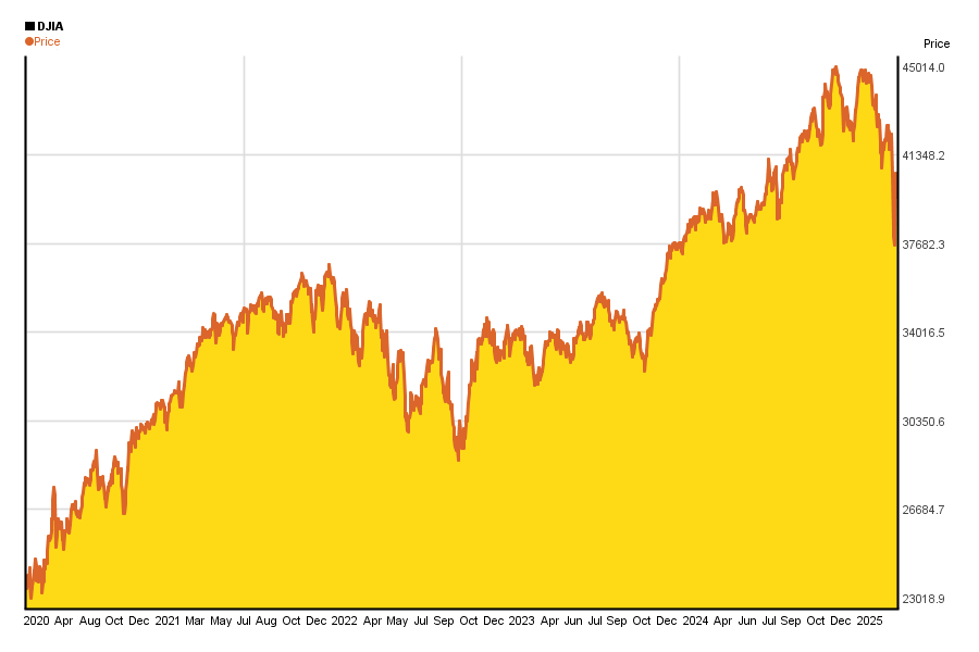
- 5 year Dow Jones Industrial Average index chart
- DJIA performance chart in the past 5 years
- DJIA performance against inflation in the last 5 years
5 year chart of the Dow Jones stock index*
The 5 year chart of Dow Jones Industrial Average (DJIA) summarizes the chages in the price well, however, we recommend to have a look at the chart(s) below, too.
Similar charts of the past 10 years can be found here.
5 years return graph of DJIA*
People often say that long term investments carry less risk than short term ones.
Well, on the chart below you can see if that is true for yourself in the case of Dow Jones for the past 5 years.
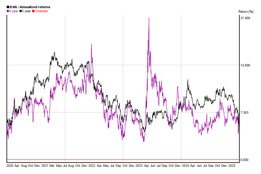
What can you see on the chart?
You can calculate DJIA’s 1 month return from DJIA’s value today and DJIA’s value 30 days ago. You can also do the same calculation for yesterday and DJIA’s value 31 days ago etc. If you do this calculation for each days, you will get a curve of DJIA’s 1 month yield. The same applies to other yield periods from 3 months to 5 years.
This chart shows the three and the five year yield curve in the past 5 years.
Treshold marked with red shows 0% return.
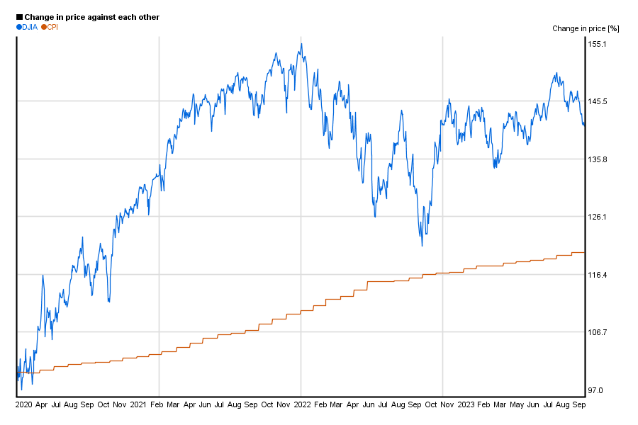
DJIA’s performance vs. inflation*
Changes of price in case of DJIA does not carry too much meaning unless we compare it to something else like Customer Price Index (CPI), or an other index.
So this chart shows DJIA’s relative change against the US customer price index in the past 5 years.
*charts are updated every month, but you can prepare similar charts for yourself by using Chartoasis Sesame. If you feel like analyzing DJIA’s historical price, you can do that for free at www.chartoasis.com/sesame . You will also need to download DJIA historical data. This step-by-ste guide will explain you how to do it.