Silver is often referred to as an investment alternative of gold. However silver’s market is not completely similar to gold’s market – there are a lot of different background factors affecting silver’s price.
(Differences between gold and silver are highlighted in the 5 year gold-silver comparison charts.)
- 10 year silver spot price chart
- Silver performance chart in the past 10 years
- Silver performance against inflation in the last 10 years
10 year chart of silver spot price*
The 10 year chart of silver summarizes the chages in the price well, however, we recommend to have a look at the chart(s) below, too.
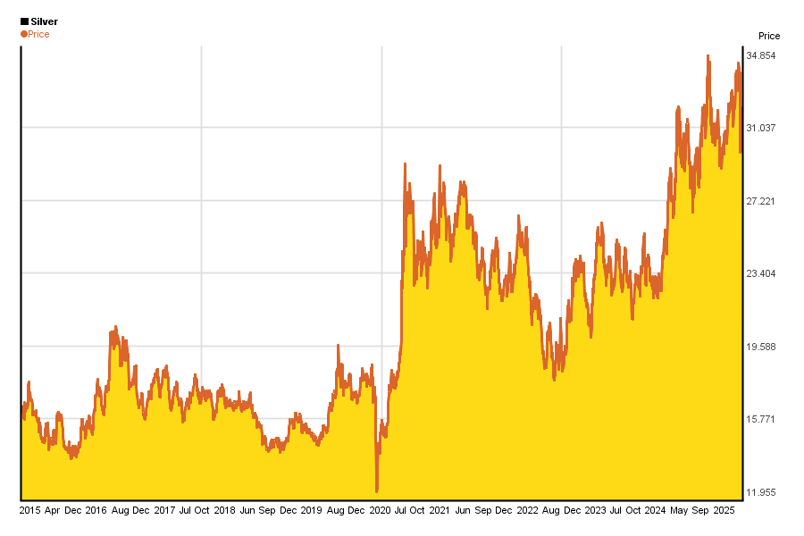
The unit of silver above is 1 oz / 1 troy ounce = 31.10348 g (Troy ounce = 1/12 troy pound. Its a measure of precious metals.).(Prices are in US dollars)
Check out silver’s price every day here.
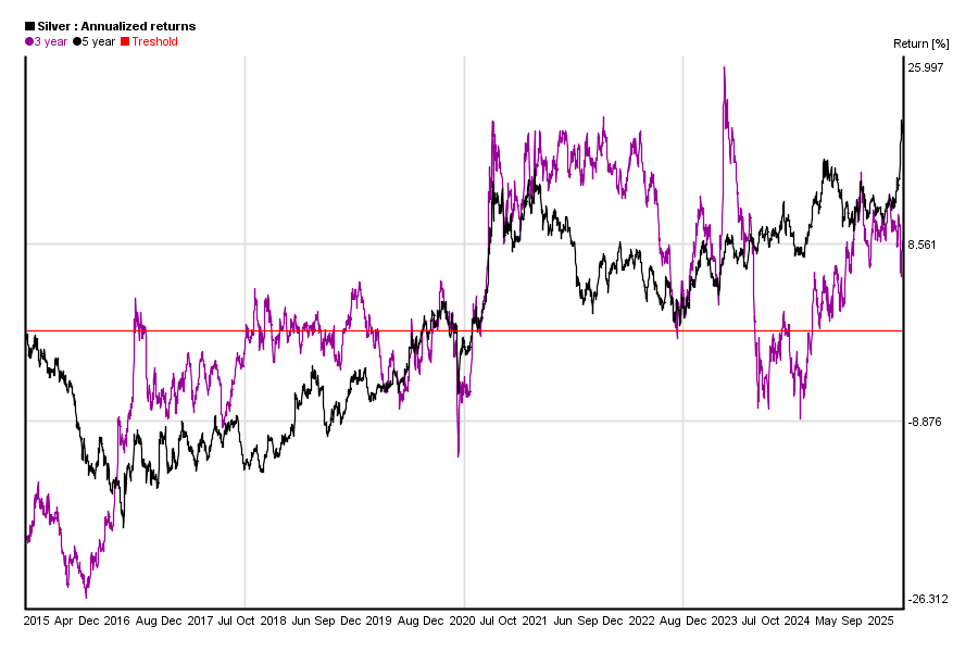
10 years return graph of silver*
People often say that long term investments carry less risk than short term ones.
Well, on the chart below you can see if that is true for yourself in the case of silver for the past 10 years.
Similar charts of the past 5 year can be found here.
What can you see on the chart?
You can calculate silver’s 1 month return from silver’s price today and silver’s price 30 days ago. You can also do the same calculation for yesterday and silver’s price 31 days ago etc. If you do this calculation for each days, you will get a curve of silver’s 1 month yield. The same applies to other yield periods from three months to five years.
This chart shows each yield curve in the past 10 years. It helps you to highlight how stable profits were.
Treshold marked with red shows 0% return.
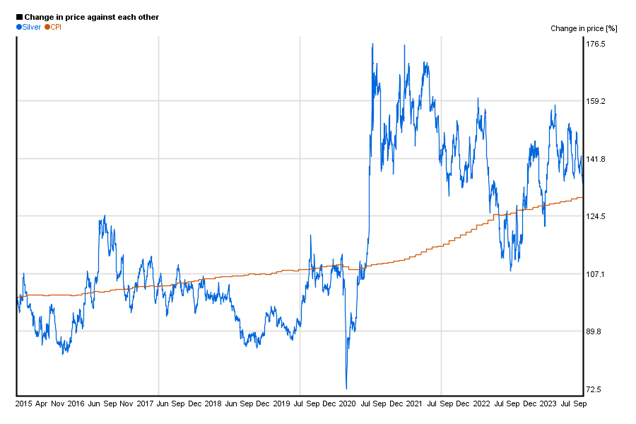
Silver’s performance vs. inflation*
Changes of price in case of silver does not carry too much meaning unless we compare it to something else like Customer Price Index (CPI), or an other commodity.
So this chart shows silver’s relative change against the US customer price index in the past 10 years.
*charts are updated monthly, and they have been created by using Chartoasis Sesame. If you feel like analyzing silver’s historical prices, you can do that for free at www.chartoasis.com/sesame . You can download silver’s historical data using this step-by-step guide.