(Differences between gold and silver are highlighted in the 5 year gold-silver comparison charts.)
- 5 year price chart of gold
- Gold performance chart in the past five years
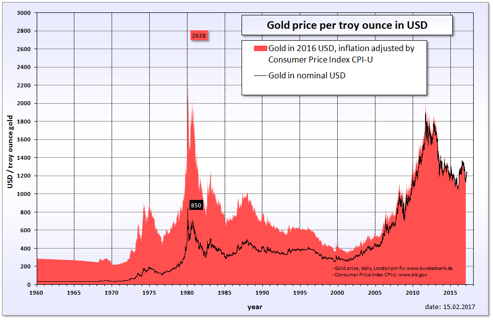
- Historical peaks of gold price – long term outlook
5 year price chart of gold*
The 5 year chart of gold summarizes the chages in the price well, however, we recommend to have a look at the chart(s) below, too.
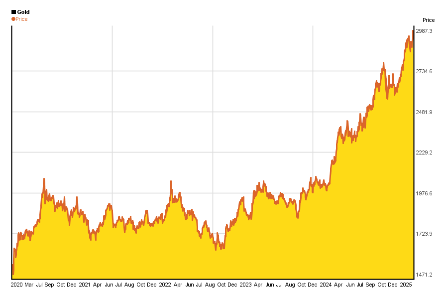
The unit of gold is 1 oz / 1 troy ounce = 31.10348 g (Troy ounce = 1/12 troy pound. Its a measure of precious metals.). (Prices are in US dollars)
You can find other gold charts from intraday up to 3 year here.
Gold’s long term yield chart*
People often say that long term investments carry less risk than short term ones.
Well, on the chart below you can see if that is true for yourself in the case of gold for the past 5 years.
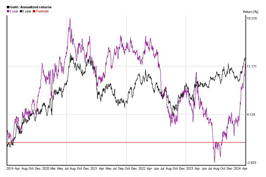
What can you see on this chart?
You can calculate gold’s 1 month return from gold’s price today and gold’s price 30 days ago. You can also do the same calculation for yesterday and gold’s price 31 days ago etc. If you do this calculation for each days, you will get a curve of gold’s 1 month yield. The same applies to other yield periods from three months to five ears.
This chart shows each yield curve in the past 5 years. It helps you to highlight how stable profits were.
Similar charts of the past 10 year can be found here.
Historical peaks of gold price & long term outlook
Financial crysis in 2008 has also boosted gold’s price in the past 5 years. But is cca. 1800$ too much for 1 oz of gold in 2010’s? Was gold worth more in the past?
Past nominal gold price is hard to compare to current price because 1 USD had different value back in 1980 due to the inflation. So chart below** shows 2 curves:
- nominal gold price
- gold price adjusted by consumer price index
As you can see, current peak is far from gold’s peak value on Silver Thursday in 1980. On the other hand this does not mean that gold price will have to go higher – past behaviour does not represent any guarantee for future performance.
*charts are updated every month, and they have been created by using Chartoasis Sesame. If you feel like analyzing gold’s historical prices, you can do that for free at www.chartoasis.com/sesame . You can download gold’s historical data using this step-by-step guide.
**source of chart is http://en.wikipedia.org/wiki/File:Gold_price_in_USD.png